So I’ve been putting off getting a tattoo for the longest time. As usual, the reason being I can’t think of a design that would be worthy of being my “first”… not to mention the fact that it’ll be permanent 1 Of course you could have it removed but still…
I figured that the safest, most sensible design would be related to my identity (since that will never change) and not just some metaphorical representation (at least for now). So I decided that my first tattoo would, naturally, be my name, birthday, or both… and what better way to present it than as an ambigram.
An ambigram, also sometimes known as an inversion, is a graphical figure that spells out a word not only in its form as presented, but also in another direction or orientation.
The offshoot of doing an ambigram is that the collection of glyphs produced end up naturally looking like symbols or patterns… and symbols/patterns are a natural fit for tattooing… at least that’s what I feel.
At first, I was supposed to just use ambigrams done by an existing online generator – because it already did an excellent job at it. 2 The first ambigram in the 3rd picture was done by the generator, I just traced and tweaked it a bit to create the second variant but I figured my name was so common, that there had to be something I could to to ensure that, at the very least, my first tat would be solely mine.
So I set out in making my own – I figured it would be interesting to give an idea of the mental process involved in making my ambigram:
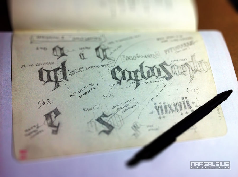
I knew my Moleskine would come in handy one day
There you have it, I’m sure different folks have different ways of creating ambigrams, but this is mine – and I had no idea how complicated it was! It was like multitasking in the sense that for every adjustment you made, you had to constantly think about how it was going to affect how it was going to affect the flipped glyph. Using a mechanical pencil and having an eraser was a must for me.
Thankfully, due to the wonders of technology, I discovered that you only really had to plot out the first half – right up to the upper portion of the center glyph. Because we’re assuming that the latter half is symmetrical.
Next step was to trace it as a vector path.
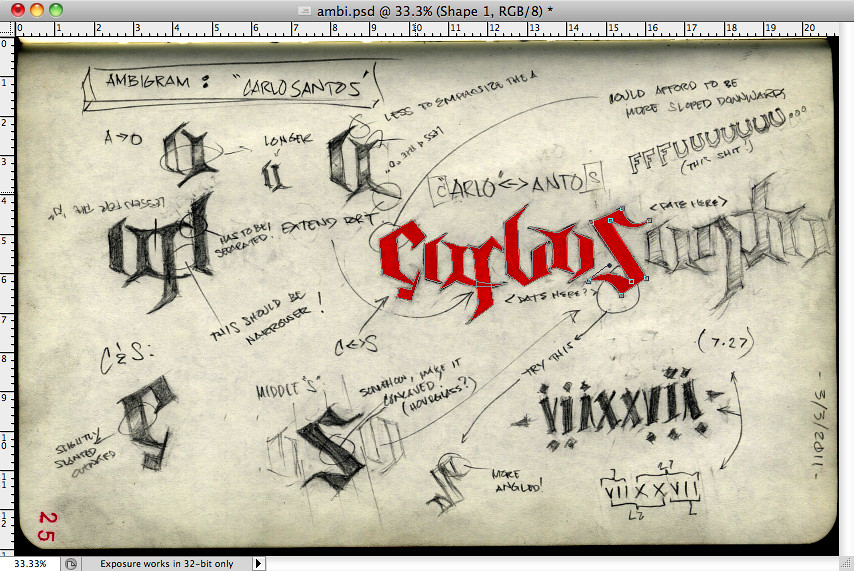
I chose to do it in Photoshop – since you could use smart objects there. The benefit of that was I just made a duplicate of the smart object which contained the first half, and flipped/positioned it accordingly. And any changes I did to the original would immediately reflect on the latter half – saved me a lot of time and it guaranteed perfect symmetry.
The tracing was fairly simple, I chose to do a rough trace since I was sure to tweak the individual glyphs down the road anyways. The most “detailed” I got were in the parts where I was fairly certain there were going to be changes in angles/curves – and made sure there were enough anchor points to edit later on.
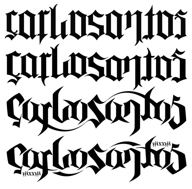
In the picture above you can see 4 ambigrams, the first is what I traced from the online generator… the second was a tweaked version of it; making it more legible for my tastes.
The third is obviously my design. I felt there were too many ambigrams done in old english going around; it seemed too common – and the attention put into that treatment was commercialized by Dan Brown’s book Angels & Demons – and of course commoditized by the online generators out there.
So instead, I chose do a semi-tribal feel – which initially was bordering on ghetto/hip-hop, but thanks to some more tweaking I finally ended with this:
I’m digging how legible this turned out to be – as my experience with most ambigrams is that unless I know beforehand what I’m looking out for, it takes a moment before I “see” what I’m supposed to see. But I honestly think that this design leaves no room for confusion.
Unfortunately not the same could be said for the small glyphs on the side; it’s supposed to be VIIXXVII – roman for 7 27 – July 27. I tried including the year, but it seemed to be impossible to do an ambigram out of it. 3 Yes, unfortunately the laws of physics still apply even to conceptual art
And for kicks, I created a simple app to demonstrate the ambigram’s symmetry (requires Adobe Flash)
Now that I have a tat design that I truly don’t mind having inked permanently on me, the next crucial decision is where to put it… but that’s a topic for another day.